Monday 25 February 2013

The Design Process - Face Charts

Taking into consideration advice from the industry and to create a better understanding of how I picture my characters make-up to look, I have designed face charts for each of my ten characters. Although I have designed the looks to my taste these are still open to change and underneath each I have written a critical analysis of how I feel about the looks including both strengths and weaknesses and whether any changes can be made to create a successful character for the final design. 

Rapunzel


I wanted to keep the make-up look of Rapunzel quite natural and pure looking, I feel I have achieved this with the soft colours and tones of pinks and creams within the make-up design. Another element of the make-up that I will add during the shoot is scars to resemble her mother cutting away violently at her hair, this is how I propose to show the darker, more violent side to the story, I have tried and tested a few products and tuplast appears to be the best option for this technique. I'm also pleased with the make-up design of the Prince, I'm going to create a crown of thorns and also use white mesh contacts to resemble the moment in the story when the prince becomes blind. I also feel that the strong contouring using a beige blush will give the face a more defined structure and create the masculine appearance that would resemble a typical prince. I am happy with both of these designs as I feel they portray the characters and elements of the story well, a change that I would make however is by adding bruising and blood around the Prince's crown and face to resemble something that is more realistic to the plot.


                                                                                              Little Red Riding Hood


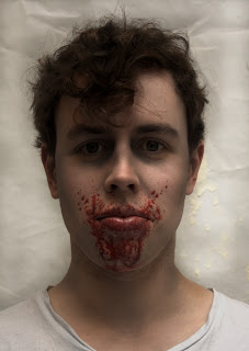
With the designs of these characters in particular I wanted to use this opportunity to show a much darker side to Little Red Riding Hood than most people wouldn't know. To do so I have tried to make the look of Little Red Riding much darker and extreme than that of a child. I feel I have achieved this with my face chart through the smudging of black around the eyes and also the dark red tone of the lip - as the story is said to hold sexual elements, I felt red would be a symbolic colour to use. I'm also going to use derma wax or gelfix to create the claw wound on the side of her face to resemble the moment in the story when she is attacked violently by the wolf. In regards to the make-up design of the wolf I found it difficult to create the face chart. I'm hoping to use brown crepe hair to create the fur on the wolf's face and I don't feel that my design demonstrates the fur well, I am hoping that it is expressed more clearly in my final images. Overall I am pleased with the wolf's design as it resembles an evil looking creature but still has human elements to it such as the shaping of the face, the dip at the front of the eyebrows also adds to the evil persona of the wolf and reflects the wolf's personality clearly.


                                                                                              Snow White & Rose Red


The story of Snow White is different to that of Snow White & Rose Red whereby two sisters are opposite in personality and appearance but also inseparable from one another. With the look of Snow White and Rose Red I am trying to demonstrate characters that are both opposite in appearance but similar in a symbolic way to resemble the closeness of the two sisters. To create a contrast between both, Snow White has to be very innocent looking with white and nude tones and soft lines, whereas Rose Red's design uses much darker colours and harsh strong lines to reflect her opposing personality. As I set out to create opposite looks I feel these designs are successful in showing that through the use of colour and an overall feel. However out of all my characters I am least happy with these designs, I have struggled throughout with how far to push each of my characters looks and I don't feel that these show enough of my make-up and design capability  I feel the looks could be re thought to create more visually enticing characters. 

Hansel & Gretel


Another design that I feel was unsuccessful is Gretel, I again struggled with how far to push the characters make-up design as in the story she is meant to be a child, although this is my first design and it can be reworked, I feel that the styling of this character will be a strong element in showing her character and personality. On the other hand the face chart I am most happy with is the make-up design of the witch as I feel the colours, contouring and detail successfully make the character look evil and menacing. I have taken inspiration from the witch make-up in the new film Hansel & Gretel: Witch Hunters whereby they have cracks coming on to their face, as my character of the witch lives deep in the forest I have expanded on this and made them look like small branches coming on to her face to make her look as if she has become part of the forest around her. Another make-up design will have to be created for the witch to show the moment in the story when the witch is burnt to death by an oven, here I will have half of the face covered in burns through the use of latex and cotton wool. 


Cinderella


Creating this look for Cinderella gave me a chance to show her as different character to the stereotypical princess image as in reality Cinderella leads a hard, working life. As she is a slave to her step mother and step sisters, I wanted the design of Cinderella to resemble her as looking very tired and worn, I also used the prominent colour of grey as in the story she sleeps every night in a pile of ash, although the scanned image of the picture has made the grey darker than how I would want it on the model's face. I am happy with the make-up design, I really like the lines under the eyes as I feel this is a quick and easy way to represent tiredness or mistreatment. I feel the design is successful in showing Cinderella as un-glamorous and unkempt as this is the true reality of her life. An element of this look that I would change is adding fullers earth onto the hair and forehead to represent the ash in which she sleeps. 

Sunday 24 February 2013

Filming - The Final Days

I've now come to the end of my filming experience at 'Ruthless', with today being my last day of filming.

I've left set today feeling very positive about the work I completed during filming and I feel that I have finished the project successfully and to the best of my ability. Although I'm starting to feel slightly apprehensive about the outcome of the final edit and the first release of the film, I'm also excited to see other people's reactions to the film, specifically the make-up and hair. 

Yesterday (Day 5 of filming), started by filming the opening scenes of the film so this involved just natural make-up for the main actors. I've found unusually that sometimes the natural make-up especially for the male actors seemed to be more challenging than the extreme zombie make-ups, I suppose natural make-up for males isn't something I have practiced much during my time at university but through filming I've now had much more experience of this and I feel more confident in completing a basic male make-up look. These opening scenes included a lot of speech and not many touch ups so I used this time to keep my work station as tidy and organised as possible, bringing with me to set bin liners to keep the area tidy. I've also noticed through filming that the most important and useful thing to carry in a make-up kit is a healthy supply of face wipes as during filming I went through a full pack a day.

Through tried and tested techniques I've now learnt that latex and tissue has been the best solution for creating successful zombie bites in the working conditions that I was placed in as it stuck to the skin well, dried quickly and didn't move or fall off during filming, the only downfall is that latex is difficult and sometimes painful to remove on hairy areas of skin so I was limited to where I could put the bites. I've had to refer to my own photographs for continuity purposes and this part of the process is what I've found probably most difficult however I've tried my best to create something as similar as possible to the earlier images so that when the film is edited and put together no differences are apparent. 

The budget for the make-up products started of at £200 but with all the extra products I've had to buy throughout filming the final budget reached £300, this has taught me about how budget and spending can change throughout filming.

Upon reflection if I was to complete a similar project and in the future I have bought a mixture of both dark and light coloured bloods to create depth of old and new wounds as towards the end of filming the blood colour became repetitive and on camera began to look too bright and slightly unrealistic.

Although there are elements of the filming process that I would change it has been a big learning curve and has helped me to build upon both new and old skills for future employment. 

Today (Day 6 of filming) and my last day on the set at 'Ruthless', most of the shots today were filmed outside on the roof of a high building, so I had to take into consideration the weather conditions here. Today was a very quiet day for me and a nice way to end the filming process as I could watch the scenes being filmed and it felt like I was fully involved with the other members of crew. Collaborating with other artists is a good way to collect contacts and learn from other people, as we all got on so well as a team we have swapped contact details and I'm hoping to work with them again  for future projects.

Over the three weekends of filming I can now say that I've thoroughly enjoyed my first filming experience, it's given me a great insight into the working life of a free lance make-up artist for TV & Film - a career path I hope to take upon finishing my degree. It's shown me both the exciting and difficult aspects of the job, such as travelling and long working hours, but as well as this it's also shown me the benefits and accomplishment that you feel when completing a project successfully and to the best of your ability.


Friday 22 February 2013

The Basics

In order to create a successful and visually pleasing book, it is paramount that I find a reputable and professional printing company that will create and publish my book to a high standard. After looking at a few online publishers I've decided to use a publisher known as Blurb, I have heard that previous students on the course have used it and through their outcomes it appears to be a reliable source and good value for money.

As well as finding a book publisher I've also had to decide on a desired book size as I was unsure whether I wanted the book to be an average sized portrait book or larger to display my work more clearly and to use it as more of a portfolio of work. I decided that the best way for me to figure out which size I liked best was to create mock up templates of each book size with white card and treasury tags to see how it looked and felt to hold in my own hands. I settled on the book size called by Blurb 'large square' which is 12" x 12" as I felt it was the perfect size to showcase strong, large images but not too big that it was uncomfortable to hold.

I'm filming for 'Ruthless' again this weekend so before I leave for London this evening I'm trying to decide on a final font and style of writing specifically for the book. I've been in touch with a graphic design student who's currently working for third floor publications and she's given me some really great advice on creating a suitable font and also how to create shapes with font on InDesign - the programme I plan on using when creating the layout for my book. I've used her help and advice to create mock up designs of my layouts and text -


I really like how the text flows around the images, I feel it adds interest to the page however I also feel that it could become slightly distracting from the image itself. The straight lined text is clear and easily readable and upon reflection the best option for my book.

After searching endlessly for a suitable font, I have managed to whittle my choices down to a final three. I used the website dafont.com to download a range of fonts that I thought would be best suitable however some of the fonts looked different when I actually typed a sentence, a lot of them were unreadable and not suitable for a book that needed readable clear text. Although it's important that the text is clear, it's also important that the text its relevant to the concept and dark theme of my book, with this in mind my favourite text choice is the first one out of the three.


Fairy tales       Rapunzel had hair spun like gold


Fairy Tales         Rapunzel had hair spun like gold

Fairy Tales        Rapunzel had hair spun like gold


In order to complete all of my work within the deadline, it is important that I am organised and that I have a devised time plan to work to. Within this plan I have allocated 9 shooting dates to complete each of my characters and looks, this plan then gives me two weeks until the deadline to create the books layout on InDesign & to leave time for the book to be made and delivered - 

5th March, 7th March, 12th March, 14th March, 1st April, 9th April, 11th April, 16th April & 18th April

As I have now planned each look to detail I know what costumes and props that are needed for each look, I have sourced each of my props so that I can now move forward and begin to make and test the props. 

Blonde crepe hair, white contact lenses, vine, toothpicks, brown, green and yellow acrylic paint, fangs, brown wool fur, acrylic nail tips, a white and a red rose, blue ribbon and a fake plant of leaves. 

Costumes will play a big part in creating the overall persona and look of a character and can help to depict the characters personality, status or wealth. I feel that to create professional images I have to use professional costumes and styling, to do so I have booked an appointment with reputable costume hire company Hampshire Wardrobe and vintage costume company Hepwrights. With these appointments in place and with my ideas and concepts coming together I feel much more confident about the process and the project ahead; I am now looking forward to the challenge of creating my own published book.

Another element that will be key to creating and portraying a dark mood and theme is my choice of lighting. This won't be a typical beauty step up, I want to create a dark and light effect whereby one side of the face is shadowed and the other is lite up. I'm hoping this will add a creepy, sinister look to my images and help to easily portray the dark theme of the book. I also find that with this light set up it adds mystery to the photo as you aren't able to see the whole face and a reader might be left to question what lurks in the darker side of the image.


Thursday 21 February 2013

Bringing Characters To Life - Cinderella

The last fairy tale that I have chosen to use in my book is the Brothers Grimm version of Cinderella. I specifically chose to use this story as although it is probably the most well known fairy tale, the Brother's Grimm version isn't so well known. Most see the story of Cinderella as the typical princess story that has the ultimate happy ending of a prince finding his future princess and although elements of these are seen in the Grimm's version, theirs doesn't hold such a stereotypical happy ending.

When researching further into the Grimm's story of Cinderella, it began to unravel quite a gruesome and gory plot. The Disney remake of Cinderella failed to mention elements of the original plot such as both the ugly sister's cutting off parts of their feet so that they could fit into the glass slipper and again both sister's having their eyes plucked out for birds at the end of the story. I felt these elements would be a good way to show the dark and less glamorous side of the Cinderella story.

The original grimm tale opens with the theme of death which on it's own is a dark subject for a childhood tale. Cinderella's mother has died and now her father has found a new wife who has two of her own children, these will become Cinderella's stepmother and stepsisters. As her father is always out at work, Cinderella's new stepmother basically uses her as a slave, she cooks, cleans and washes for them and in return she is forced to sleep in a pile of ash by the fire at night.


It is important to create character looks based on information found in the story, these stories are the sources of the character. So I've used this element of the story to design Cinderella's first look, she is described throughout as being both dusty and dirty so I am going to use fuller's earth in the hair to create a dusty, dirty effect. With a darker coloured eye shadow or cream I will accentuate the lines under her eyes to make her look tired and worn, as well as using a stipple sponge and brown greasepaint to create dirty scratch marks.


Hopefully these techniques
along with styling of a ragged style dress will be successful in creating a dirty, tired and worn looking character, one that evokes sympathy from an audience.


To again show Cinderella's life as being both unglamorous and unpleasant and to continue to receive sympathy from an audience, I will have close ups in the same composition as these images seen here. One of Cinderella crouched on the floor in her rags crying and another of her dirty hands and fingernails up to her face as she is crying.
Although the main concept of this book project is too show the darker, more gruesome side of fairy tales, it is an important part of the Cinderella story to show her transformation from a dirty, unkempt character into a lady dressed in gold and silver that attracts the Prince at his ball. 


I am hoping to use this type of composition to show her transformation by taking several moving shots and using Photoshop editing - this will be the most complex shot seen in my book.


With the composition of shooting the look of the character of the ugly sister I want to try to re create a Victorian portrait style photo. To do so I have researched further into Victorian portraits of women both old and modern interpretations and all include a female standing just off centre with her shoulders and head turned slightly away from the camera. I will attempt to re create a similar composition with the character of the ugly sister but I'll also have her chin slightly tilted up to show how she feel superior to Cinderella and to also show how she admires herself and doesn't think of herself as ugly at all.


In many re-interpretations of Cinderella the ugly sisters are portrayed just as their name sounds - ugly. However nothing in the original story mentions that they are unusually ugly, it only mentions that they are 'fair of face but foul at heart' and this is the only thing that could interpret them as being ugly. I felt quite a gruesome way of interpreting this would be have a close up of the ugly sister holding a heart (you can buy pigs / sheep's hearts from butchers or supermarket.) Although this is quite literate, I feel it would be quite symbolic as well as quite disturbing.


The most dark parts of the story are focused around the ugly sisters. When the prince comes by their house to try and find the owner of the glass slipper, the stepmother encourages one of the ugly sisters to cut off her toe and the other her heel in order to fit into the slipper and become the princes wife. This plan works until the Prince notices blood streaming from the sister's stocking, to recreate this element of the story I will have another close up of this, simply by staining white stockings or tights with stage blood.


As I mentioned earlier the story ends with the ugly sister's getting their eyes plucked out by pigeons, this to me is the most important element in creating a dark and sinister feel to my book. Through my love of prosthetics I have learnt how to create this missing eye effect with special fx make-up. You start by cutting a piece of black card to fit the size of your eye shape, you then stick this down with wax and use a bruise wheel to create a bruised like effect around the cardboard, then use stage blood to fill in the black section of the eye and dap around the eye to create a bloody effect.


Wednesday 20 February 2013

Bringing Characters To Life - Hansel & Gretel

Another Grimm Brother's fairy tale that I have chosen to include in my book is the well known tale of Hansel & Gretel. Although this story is well known by most, the original Grimm tale is much more gruesome than the story that circulates now. I felt that I could use these more gruesome elements to again experiment with special effects make-up and to hopefully show to an audience the darker, less known side of these childhood  tales.

Hansel & Gretel are a brother and sister that live in a small house with their father and his wife (their stepmother). The husband is the breadwinner for the family and as work is low he is struggling to provide for his wife and children, so much so that he can't even feed themselves any longer. The step mother orders the father to send his children deep into the forest so that they can fend for themselves and he will then no longer have to worry about their welfare, the father refuses so the next morning the step mother alone walks them deep intp the forest and leaves them there.

 'Early tomorrow morning we’ll take the children out into the forest and give each of them one more piece of bread. They will not find the way home again, and we shall be rid of them.' 

 This on it's own could be seen as representing dark themes such as child neglection or a form of child abuse, a subject that wouldn't be suitable to read to a child.


Although the main characters of the story are Hansel, Gretel & The Evil Witch, I have chosen to recreate just two of the characters - Gretel & The Evil Witch as I felt these played the biggest part in the plot of the story.
After Gretel is left with her brother in the forest, both begin to walk aimlessly through the forest trying to find their way back home, on route they come across a little house that's built with cakes and bread and has little windows made of sugar, the house looked so tasty to them that the staving children began to eat away at the house. From this point in the story Gretel is seen as quite glutinous, to show this symbol of greed I researched into a term called 'sploshing', it is a name for the reference of mixing food and sex together however I looked mainly at the food side of the term.

To show this term in a less sexualised way I am going to have a mid shot and a close up of Gretel sat on the floor with her hands full of cake, eating messily as if she's never eaten before.  


Throughout the story Gretel comes across as being quite shy, timid and very childlike as she cries to her brother in despair several times. I feel the best way to portray this is through both costume and composition, I want to - for example as well as wearing a child-like piniform dress, Gretel could be sat on the floor or in a crouched position as seen her in Tim Walker's recreation of Bette Davis.


Gretel's character is very much about showing her transformation from a shy and timid child into a strong character that ends up throwing the Evil Witch into a hot burning oven of fire as apposed to a extensive make-up look, it is the Evil Witch that's going to be the more creative and visual character. In the story the witch lives deep in the dark forest and lies waiting for children to enter her land so that she can fatten them up with treats and then eat them. Through costume, make-up and special effects make-up I want to show the Witch as being actually part of the forest by using dark colour shades such as green, blacks and browns and through the use of materials such as vines and leaves in the hair and on the clothing. 


For my make-up design I have also taken inspiration from the new film released version of the fairy tale named Hansel & Gretel: The Witch Hunters. In this adaptation the witches change from normal looking humans into evil, scary looking witches and with this witch in particular her face becomes pale, dark and cracked. I have taken inspiration from this cracked effect with the make-up design for my witch, as I want her to appear as part of the forest I'm going to create branch like cracks coming from the outer edge of the face into the centre; I feel this will be both in keeping with the theme of the forest.


The Witch is described in the story as being as old as the hills, I have bought old age stipple from Charles Fox and I'm going to use this on both the mouth area, the eye area and the hands to create an old, wrinkled effect on the face. As I am having a close up of the witches mouth snarling I am going to use tooth enamel in brown to stain the teeth slightly, I feel this along with the wrinkled effect will look both effective in creating an evil and scary look. 


In the same way that I'm using old age stipple on the face, I will also use it on the hands. I'll have another close up of the hand reaching out to imply the witch grabbing out for the children that lay waiting. I am also going to make my own long and pointed witch nails in the same style as seen in the image here.  


After the Evil Witch has lured the children into her house, she uses Gretel as a slave, she lights the fire each morning and heats up the water in the cauldron. One morning while Gretel was doing her daily chores the witch was stood near the open fire, with all her strength and mite Gretel pushed the witch into the burning fire and both brother and sister than escaped unharmed. On a six week prosthetics course I learnt how to create burns with latex, so I feel confident now in creating a burns look for my witch character, I am going to have a head shot of half of her face burned. I feel this will be both a shocking and terrifying image, one that an audience wouldn't expect from the story.

Monday 18 February 2013

Bringing Characters To Life - Snow White

The third Grimm Brother's story that I have chosen to include in my fairy tale is that of Snow White & Rose Red, it is important that this story isn't confused with Snow White, they are two completely different characters in two completely different plots.


Snow White & Rose Red is a story about two sisters that live deep in the forest in a cottage with their widowed mother. I found this story most interesting due to the relationship between the two sisters. I felt that there was a lot I could do with both characters as in the fairy tale they are described as being complete opposites in personality but also inseparable as sisters and friends, after reading through the story a couple of times I came up with the idea of having the characters as one person with split personalities - one innocent and the other evil, almost like that of a schizophrenic.


In the same way schizophrenics tend to show elements of two different people so will my character. The first character, Snow White is described in the story as quiet and gentle and I pictured her character as very innocent and pure in both character and appearance. I felt this best way to send this message was through the use of white as it is very strong in quickly portraying a message of purity and will be easy to use an opposite much darker colour for the character of Rose Red. I would preferably like to find a model with either white or light blonde hair as I feel a wig wouldn't have the same effect, I will then use a white flowing and simplistic dress for the costume, pale make-up such as a nude lip and white or cream eye shadow and white eyelashes.


I would like the hair to be off the model's face as I feel this will give the look a child-like element and again rein-force the idea of innocence and purity. The image shown here is very successful in creating a very natural mood through elements such as simplistic, neutral make-up, soft lighting and dainty, feminine clothing. I hope that my image will be as successful as this in creating a mood of both innocence and purity. 


'A person diagnosed with schizophrenia may experience hallucinations, most reported are hearing noises, delusions, often bizarre and disorganised thinking and speech.'


I wanted to take the closeness of the two sisters and use this to portray them as both the good and the sinful versions of each other. To show this through just appearance Rose Red must look much more obviously evil than Snow White through mainly costume, make-up, lighting and composition (e.g. facial expressions). Although the elements of this story aren't as obviously dark and gruesome as some of the other Grimm tales, I am going to exaggerate the idea through a dark and unattractive looking Rose Red portraying the devil side of Snow White. Much like this image I am going to make Rose Red's skin imperfect  and her hair matted and unkempt, her eye make-up will be very heavy and dark as will her lips. I hope that this is comparison with Snow White's pure clean make-up will show an obvious difference in both their appearances and personalities.


As first seen in the title of the fairy tale, roses both white and red are very symbolic and mentioned throughout the story as clearly main aspects of the story as a whole. A rose is symbolic of love and in this particular story an example of the love and bond that the two sisters share, it was paramount that I also used roses as a symbol in my images. 


In my book there will be one close- up of Snow White holding a white rose and another in opposition of Rose Red holding a red rose in her mouth. Both are symbolic in both action and colour in portraying with the same object two completely different messages and I hope that this will also become clear to a viewing audience. 


Another single image will be that off scattered red and white petals mixed on the floor.


Sunday 17 February 2013

Filming - Day Four

I am now into day 4 of filming with only two more days and one weekend left of filming, through all the months of build up towards the project it's gone so quickly and I've enjoyed every minute of it, even though I have found some parts of the experience both difficult and challenging.

Today was by far the busiest day of filming as we had 30 extra's to make into zombies for an outdoor outbreak scene filmed in the street whereby four security guards were on patrol to stop the pedestrians coming through. 

I had three assistants helping me on the day and to keep a nice flow of work I gave each person a different element of the make-up to complete. I showed each girl how I wanted the make-up to look but after showing them this I noticed that they weren't following me correctly and I soon became frustrated at how much white paint and black eye shadow they were using on the face; the zombies were meant to look more human like than dead so I found myself going back around each person's work and correcting their make-up mistakes. After a few times of doing this I asked to see every zombie before they left the work station so that I was happy with how they looked before they went into filming. However as we were on a tight schedule I didn't feel like the make-up was up to my standards but pressed with time and reassured that they were only going to be filmed quickly I settled with their looks. It was quite frustrating for me that I didn't have enough time to go around each and every one of the extras as one of the assistants gave herself  free reign with wounds and cuts to the point where they didn't look realistic anymore, I tried to salvage some of the looks as best as I could. 

Although I faced some frustrating moments I enjoyed the fast pace of today, I spent most of the day outdoors on set and I felt confident and friendly enough within the team to voice my opinion when I felt necessary. One of the main difficulties that I faced was trying to change up each zombie look for the extras so that they didn't become repetitive as we did over 30 zombies. By the end  of the process I felt the looks were getting slightly repetitive so I am going to spend some of next week trying to create some more face templates so that I don't repeat looks that I've already done. I've used a large portion of the budgets make-up products today but I am still yet to use much of the hair products, again I feel like that I should have paid more attention to the hair so that it matches and ties in with the more extreme zombie looks.


Bringing Characters To Life - Little Red Riding Hood

Another fairy tale that I have decided to include in my book is the well known fairy tale - 'Little Red Riding Hood' or by the Grimm's tales 'Little Red Cap'. I have always been fascinated by this story and the many connotations that the story could hold; the relationship between both Little Red Riding Hood & The Wolf and from this ideas surrounding sex or sexual desires. 


As well as this, the whole setting and concept of the story evoke both darkness and an eary feeling as most of the story is set deep in the forest whereby no one is around to protect Little Red Riding Hood from the wolf. 


I also felt that the characters and plot of this fairy tale would give me great creative scope with regards to my love of special effects and prosthetics. As this is a part of the industry I'd like to learn more about I felt it was important to show my enthusiasm for the subject through my final major project piece. 

Little Red Riding Hood

The fairy tale opens by describing Little Red Riding Hood as a dear little girl who is loved by everyone, so it is important that my interpretation of her character is either shown as naivety or vulnerable - as these types of people tend to evoke the most sympathy. 


I feel the best way for me to do this is through composition, the composition shown here of the girl looking down and away from the camera immediately makes an audience feel sympathy for the character as she could look either upset or in some way hurt.  


It's not far into the fairy tale that Little Red Riding Hood's red cloak is mentioned. It is this symbolic cloak that makes her character so recognisable to so many people. My book isn't going to contain much text, just one or two important sentences on a page so symbolic items such as Little Red Riding Hood's red cloak will become important for easy recognition.


I want to use a short red velvet cloak along with a short, frilly skirt and white socks or tights to create a child-like image but also a slightly unreserved look. I don't want to take the promiscuity too far as the character is still a child however many criticisms of the story describe the relationship between Little Red Riding Hood & The Wolf as a sexual one, perhaps with the setting off a young girl alone in a forest being followed and approached by a stranger.


The Grimm Brothers tale ends with The Wolf eating both the Grandmother & Little Red Riding Hood, I wanted to use an element of special effects to show the violent attack on the young girl. I am going to use either tuplast or gelafix to create height and the illusion of deep claw marks across the face and also bruising colour and fx blood to create a viscous and sore looking wound. I am hoping this will create a shocking effect for an audience and as they turn the pages the timid, shy face of Little Red Riding Hood becomes manipulated.


The Wolf

For me the character of the wolf is the main focus of the fairy tale, for it is his character that has the most speech throughout the story; he approaches Little Red Riding Hood in the woods, follows her to the Grandmother's house and then eats both of them before being killed by a near by hunter. Through prior research I feel like the wolf's character is more human like than animal, so I want my interpretation of the wolf to hold both human characteristics as well as elements that will define him as a wolf.


To show the wolf's menacing side and to create an evil like snarl, I'm going to make a prosthetic piece molded with gelafix and cotton wool, this will give height to the eyebrows and hopefully create a more pointed brow. I will then add with spirit gum wolf like fur with either crepe hair or pulled wool to create a more realistic eyebrow.


In the same way that I am adding fur to the eyebrows, I will be adding fur to the face. Like this image I don't want to go over the top with fur as I want to keep the wolf looking more human than completely animal like - almost as if catching the moment of transformation between human and wolf in a full moon.


 To really draw attention to the dark and more violent sides of the fairy tales and this one in particular, I will use more intimidating single close ups of the wolfs teeth and fangs, the long and sharp wolf claws and frowned brows.


As you can see from my image references I have taken inspiration from the film 'Wolf' featuring Jack Nicholson, this clip shows the scene of the film where he is followed by 3 strangers who threaten to rob him, through the scene you can see elements of his appearance change just slightly into that of a wolf, once fully transformed he then pounces and attacks the men.


In regards to the wolf's claws I am planning on making my own with acrylic nail tips and acrylic paints using the same technique as this.