Tuesday 19 March 2013

Creating a Mood

It is important to have some kind of mood or theme to your ideas and here in the case of my book the mood is key to the message I'm hoping to portray within the book.

I have created specific mood boards for each fairy tale with the intention of using them to create a mood as apposed to demonstrating styling or make-up ideas as I feel I have done this through each characters separate blogs. With these mood boards I wanted to show quite clearly the darker and more eary side to fairy tales that people don't always know as this is the whole concept and aim of my book. I used photo shop to create each mood board and I used the opacity tool in order to create transparency, I did this as a way of reflecting the idea that there are darker hidden messages that we've never been told in the well known child hood fairy tales that have been passed through our generations. The intention of my fairy tale book is too show these darker elements and to use specific gruesome or gory points in the stories as main parts of my make-up looks but to also use styling as a way of making the characters recognisable to an audience, for example Little Red Riding Hood's red cape is an obvious symbol in depicting her as that significant character.

 Overall I am very pleased with the outcome of my mood boards and I feel they are successful in portraying a certain dark and eary mood while still showing clearly elements of the original stories that I want to display through make-up and styling in my book.


Little Red Riding Hood


Cinderella

Rapunzel

Hansel & Gretel


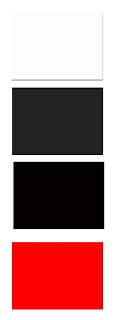
Another key element that can be used to quickly create and depict a mood is colour. Here I have created a small colour chart of essential colours that I want to use throughout my book layout and my film portfolio so that both link together clearly and are relevant to one another. Black will be the main colour as this will be the colour of my books background and all of my images will be shot on a black back drop. I'll then use either a white or a grey font for the parts of the stories that will run along the pages alongside my images, I feel white will probably be the most successful option as it will be clear to read and opposing to the dark black background. The colour of red will be reoccurring throughout my images as most involve some type of violent act that involves blood or gore, it is also important that red is symbolic of danger. 


Friday 15 March 2013

Setting the Pages


 In order for me to fully visualise how the book will look and to help me with the planning of my looks and how they'll run through each story I felt that it was vital for me to create a basic book layout plan. I wanted to see which images looked best as double page spreads and which ones had enough character and depth to stand alone on a single page. I used secondary images to show mainly the composition of the imagery and how each image will sit in the book.


This exercise has been extremely useful in helping me to plan each shoot and the images I want to get from each shoot. Following this exercise I have made a shooting plan for each character so the photographer and myself are clear with the running order of the make-up and shots, I'm hoping this will help with the organisational elements of each shoot and look.

I'll also be using this book layout when it comes to designing my final book layout on InDesign, although this design is open to change and each photograph will have to go with the extracts of the stories that run along the images this will be the most helpful element as a starting point for my book design. 


As well as creating a book layout plan with images and directional text, I have also created a book template of the size book I am hoping to print. The book template is 12" x 12" and I choose this size as I felt it was big enough to fit an image clearly and with space for text and wasn't too big whereby it was uncomfortable to hold or handle. Some pages of the book will be images on a double page spread shown below whereby others will sit alone on a single page spread, others will have just text. I am also planning on having a title page for each fairy tale as well as a quote for each on the opposite page, I feel this will bring the concept of the book together and will be successful in creating a link from one story into another.


Although I originally felt happy with the size choice of the book, upon reflection and after some thought I feel that the book may be too large and that the images will be too small to fill the page, leaving a lot of empty black space and not utilising the whole of the book size. As I don't feel fully positive about the decision, I am yet to go ahead with choosing a final book size and I am currently in the process of deciding whether to choosing instead an average portrait sized book that is 8" x 10" as by sticking to an average sized book it is more in keeping with my competing horror novels and will be more appropriate and relevant for a book that could actually be sold in a shop, as the sizing of the book is easy to hold, carry and read.

In order to help a reading audience understand the concept of my book and to put my images into context, I have decided to include an introduction to my book. The introduction will firstly introduce fairy tales as a whole and how they are relevant to our society now, I will then go on to talk about where fairy tales derived from and how they originally came about. Following this I will start to bring in the idea of the darker side of fairy tales and here is where I will introduce and discuss the fairy tales written by the Grimm Brother's, describing the darker, more violent side to their tales.

Here I have written a first draft introduction for my book -

fairy tale - noun

A children's story about magical and imaginary beings and lands.
A term used to describe something blessed with unusual happiness.

But are fairy tales all that happy?

    The interpretations of fairy tales that circulate nowadays have evolved greatly from the original tales of the 1800’s. These re-creations now are very much about the ideal happy ending and the idea of finding true love with your Prince Charming, something that most single woman pine for. However the original tales that began to circulate in the 19th century lacked the happy endings that we now associate with fairy tales, mainly because in reality, there were none. Through analysing the original tales it becomes apparent that these enchanting, lovable tales are actually filled with all sorts of power struggles, of money, women, children and land and are often set in a violent and gory plot. Many represented the huge divide at the time between that of the peasantry and the aristocracy and used symbols of violence and cruel punishments to express their conflicts and struggles.

     The fairy tale stories collected by Jacob and Wilhelm Grimm in the early 1800s show us life as people knew it, capricious and often cruel.  So if you’re looking for a sweet, soothing tale to waft your child into dreamland? Then look elsewhere as these tales are not suitable children. The Grimm Brothers were German authors who together collected and published folklore. With their book Children's and Household Tales’ they popularized some of our most well-known tales such as Cinderella, Snow White and Rapunzel all of which are now available in more than 100 translations and have been adapted by filmmakers such as, Walt Disney. However unlike the Disney remakes, the tales written by the Brothers Grimm were in actual fact quite morbid and frightening stories. They show us the darker side of fairy tales, marked by scenes of lurid violence, including graphic descriptions of incest, murder, mutilation and cannibalism; branded by both the clerical and the secular powers as damnable and inspired by the devil. In the corpus of the Grimm’s tales there are approximately 25 in which the main focus is on children who experience some form of abuse, whether it be starvation, incest or neglection. The brother’s began to recognise that their fairy tales were far from culturally innocent and even as they sought to remove traces of sexual and violent elements, they rarely exercised their prerogatives to tone down descriptions of brutal punishments as many of these elements still remain today. 

This book aims to show that unknown violent and dark side of fairy tales by using original storylines and plots of four of the Grimm’s fairy tales, Little Red Riding Hood, Rapunzel, Hansel & Gretel & Cinderella. 

Saturday 9 March 2013

Rapunzel

This week I had my first shoot that will be going into my fairy tale book and although I felt fully prepared for the shoot, I was nervous about how the images would turn out as I knew I had a lot of preparation work to do mainly with the hair before the shoot could take place. I also really want my concept to come through in my images, the concept being the darker side of fairy tales with dark, more eary looking images and the more the project goes on the harder I feel it will be to clearly show this concept to an audience.  

The best way for me to talk about the shoot and the complications and successes I faced is to talk about each element in chapters separately. 

But first here are some of my favourite images from the Rapunzel shoot - 


The Make-Up 

With the first images of Rapunzel with long hair I wanted the make-up to appear simplistic and very natural looking and although I feel that I created a successful natural make-up, I have always thought that this type of make-up design is sometimes the hardest to achieve. For the second part of the make-up look I added tuplast to create a scar like effect on the models face, this was to represent her step- mother violently cutting away at her face and hair with scissors. At first I added too much red ben-nye colour to the scars and on camera they looked obviously unrealistic so I had to correct this with a skin coloured greasepaint. Another difficulty I faced with this make-up product was that after a while the tuplast started to peel off the skin, most likely due to the heat of the studio lighting. I have tried to correct this as much as I can with editing and thankfully the images I feel are still effective; particularly the ones with the harsher shadows as they pick up on the texture and height of the scars. 

The Hair 

Out of all the elements of the look, the hair was by far the hardest obstacle to overcome. I spent an hour of preparation time in the studio trying to get the crepe hair to blend well with the wig, this was more difficult than I had anticipated. I had to spray the crepe hair in different shades of brown kryolan hairspray and also steam the crepe hair over hot water so that it would match the texture and colours within the wig. I then used hand decorated white small roses to detract from the wig and the crepe hair as I was worried both would look unrealistic on camera, however the outcome in the images is much more successful than I had imagined. For the second half of the shoot the hair had to look as if it had been cut off, it was difficult to achieve the exact look I wanted as I couldn't actually cut the wig. I had to create the illusion of short hair by tying and pinning the hair back but as the wig was so course and heavy, it wasn't easy to manipulate into the exact shape I'd hoped for.

The Styling 

This is the part of the final images that I feel least confident about, I chose an original outfit but the day before the shoot I decided that it wasn't going to work within the image. I researched further into old paintings of princesses and the clothing they wore and I ended up choosing a completely new dress the morning before the shoot. It seemed a bit risky to change outfits at the last minute but I felt this dress better fitted the theme of both innocence and purity. The part of the styling that I dislike though is the gold decoration at the front of the dress as well as the gold decoration along the sleeves as I feel it looks quite Grecian and not relevant to the image or character. Also the dress was way too big for the model and even with bull dog clips at the back of the dress it still could of been tighter and more cinched at the waist and breast to give the dress an overall better fit.

My main aim for this character was to show her drastic change from a stereotypical Rapunzel princess character into a vulnerable, disheveled looking women who's been cast out to the desert to live alone, the story line of the original fairy tale. I feel the change in make-up, hair, styling and lighting are successful in showing the contrast between both of the looks. 

Tuesday 5 March 2013

The Design Process - Test Shooting

To create successful final images and to be fully prepared for a shoot, test shooting either on a model or yourself is vital. I felt the best way for me to practice with techniques and make-up application would be to make-up myself to see how the design transferred from paper to face and whether from this I could see any elements that needed re-working or changing completely. Completing this process has really opened my eyes to how I actually want my designs to look, as sometimes original face charts don't transpire so successfully onto the model's face. I've decided to change some aspects of my make-up designs in order to push my make-up skills and the characters looks further and to use this opportunity and this unit to show my creative and design capabilities. 

Test Shoots

A range of test shoots that I felt were most successful.

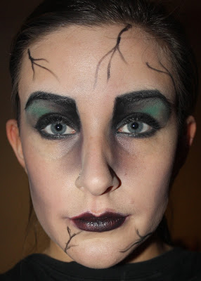
This is a test shoot of the evil witch in the original story of Hansel & Gretel. The elements of this look that I like are the colour choices of green and black as they are in keeping with the theme of the forest. I also like the shaping of the eyes and how the two colours blend together on the lid, however upon reflection I would bring the eyebrows in to more of a point at the nose and block out the model's eyebrows before hand so I can create a much higher unnatural arch to automatically give the character an evil look. I'd also go even further with the depth of the contouring and shape of the lips to really accentuate witch like features such as a pointed nose and chin, another technique I could use to created the illusion of a more pointed nose is to paint black above the nostrils, adding to the natural nostril line.

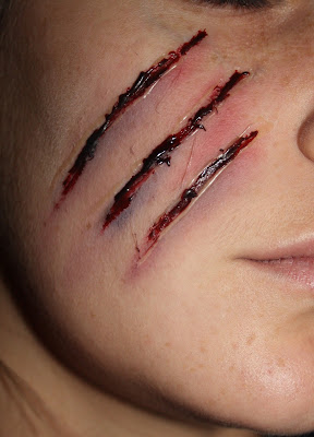
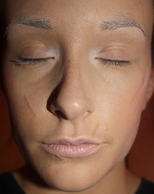
This is a test shoot of the cuts that will appear in the second make-up look of Little Red Riding Hood to show the violent attack from the wolf. I tried and tested a few different make-up products when test shooting this technique - derma wax, gelfix and tuplast, this image is the cuts I created with tuplast (a clear thick gel that can be manipulated on the skin before it dries). I like the shaping of the cuts here but I feel that shot from a further away angle that they might get lost in the picture and won't be as clear and striking as I'd hoped. To make the cuts look more obvious and to convey a clearer message I will bring the cuts further down the face so that they cover most of the cheek. Here I have created quite light bruising as I was afraid it would look unrealistic however for it to show up well on camera I would use more colouring of blue's, red's and black's around the cuts to emphasis the bruising and depth of the cut.
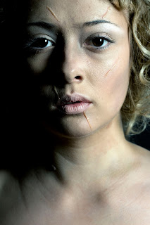
As with the image above I used the same product of tuplast to create the scars that Rapunzel encounters during a moment of mad rage whereby her step mother violently chops off all of her hair. Under this lighting the red ben nye colour that I add to the tuplast scars isn't as harsh or visible as I would have like so I will use more red in the actual shoot on the one side of the scar and on the other side I will use more white to highlight the texture of the tuplast and to create the illusion of height to the scar. 
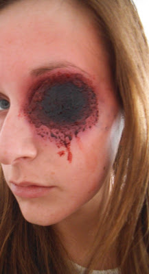
This image is a test shoot I did on myself as part of the story line in the original fairy tale of Cinderella whereby at the end of the tale the ugly sister gets her eyes plucked out by birds for her wicked and evil ways. This is a self taught technique that I picked up through researching special effects techniques on the internet. To create this look I used black cardboard, derma wax, a bruise wheel and stage blood and to create it was actually easier than it looks. I feel with more preparation time and professional studio lighting the technique will be successful in showing that element of the story and won't look so obviously like black cardboard but more like a black hole full with blood.
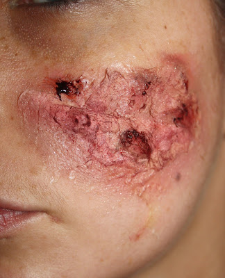
This was a test shot of burns that I did for the second make-up look of the witch in the fairy tale Hansel & Gretel whereby Gretel pushes the witch into a open oven of fire that burns her miserably to death. Through my keen interest in special effects I attended a six week special effects course so I feel confident in creating wounds such as burns, bites or cuts. To create this technique I used cotton wool and latex stuck to the skin in layers to create depth and texture to the burn. I'm really happy with the outcome of this test shoot as I feel it looks really realistic, the only difficulty I might face when shooting this look is trying to keep continuity with both colour and texture as it will cover a larger area of the face than here. 

Monday 4 March 2013

The Design Process - Costumes & Styling

To source costumes for my characters and gather inspiration for their styling I have visited Hepwrights Vintage Shop in Bedford Place, Hampshire Wardrobe in Winchester specialising in costume hire and lastly Beatrix Emporium a vintage shop in Southampton's town centre. 

Here are some of my first costume ideas for each character although I will have to choose only one for each as I only want the characters make-up to change through the shoots and not the clothing, each character will stick to just one significant piece. 

Rapunzel

I choose these pieces as I felt they had an essence of femininity and innocence with the pastel and more pale tones and the soft flowing textures and cuts of material. They create a sense of purity which is what I hope to get across in my representation of Rapunzel's character, this will also be reflected in the simplicity of her make-up.


The Prince

I used to be part of a dance company when I was younger and was regularly involved with the theatre and played parts in several pantomimes  This outfit is one that I wore as part of a extras cast in a pantomime and after sifting through my attic I found it and felt that it would be perfect for the styling of the Prince. It is tight fitted and a deep blue velvet material that gives it a luxurious look and feel, I also think that the design and fur elements are apt to the styling of the time and when researching costumes and clothing of old princes this is type of jacket that they would have worn.


Little Red Riding Hood

Both these capes are two different shades of red and I prefer the cape with a darker shade of red as I feel it gives a more luxurious feel and reflects the velvet material of the cape mentioned in the original story, however the other choice of cap is shorter and would work better for styling underneath the cape and a full length image, these are things I will have to consider before hiring.


Cinderella 

 I thought that these three dresses from Hepwrights resembled the rag - like style of dress that I was looking for with Cinderella's styling. I really like the orange dress as I feel it will work well with the merging composition as it has a flowing piece at the bottom but my favourite of the two is the duck blue dress as it is more accurate to the grey rag dress described in the original story. 


Ugly Sister

With the styling of the ugly sister in Cinderella I pictured her to look like a young woman from the Victorian era. So when looking further into this I spent a lot of time researching Victorian fashion, I remembered that my mother owned a Victorian style dress that were actually her bridesmaid dresses and I feel the shape, fit and style of this dress will be perfect for the character of the ugly sister, I also feel that the light blue tone of the dress under lighting will add to the dark theme of the book.


Gretel

I want Gretel to appear through styling and make-up as a child, I felt the colour of this dress, baby blue, was successful in doing this, this dress also reflects what I originally wanted with Gretel's styling.


The Witch

With the styling of The Witch I will be adding onto either dress with vine and leaves to create a dark, forest like appearance to the dress. I really like the darkness to the one dress and also the material as I feel it will pick up on the camera well with lighting however I also like the texture of the other green dress as it reminds me of the texture of a tree bark, I need to decide here whether I want the theme of darkness or the theme of the forest to be the most prominent aspect of the shoot.


Snow White 

I wanted the character of Snow White to come across as especially innocent and pure looking so the colour white was an obvious choice. I stuck with this colour theme when looking for my costume ideas. Out of all my characters this is the one that I've found hardest to choose as I feel all the dresses symbolise purity in some shape or form. I wanted this look to be quite simplistic so I have chosen dresses with little detail and no colour or patterning.  


 Out of all the dresses I have shortlisted, I now have the difficult task of deciding which dress is most suitable in regards too make up, hair, and the overall theme of the Snow White story.