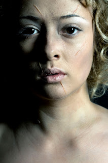
This week I had my first shoot that will be going into my fairy tale book and although I felt fully prepared for the shoot, I was nervous about how the images would turn out as I knew I had a lot of preparation work to do mainly with the hair before the shoot could take place. I also really want my concept to come through in my images, the concept being the darker side of fairy tales with dark, more eary looking images and the more the project goes on the harder I feel it will be to clearly show this concept to an audience.
The best way for me to talk about the shoot and the complications and successes I faced is to talk about each element in chapters separately.
But first here are some of my favourite images from the Rapunzel shoot -


The Make-Up
With the first images of Rapunzel with long hair I wanted the make-up to appear simplistic and very natural looking and although I feel that I created a successful natural make-up, I have always thought that this type of make-up design is sometimes the hardest to achieve. For the second part of the make-up look I added tuplast to create a scar like effect on the models face, this was to represent her step- mother violently cutting away at her face and hair with scissors. At first I added too much red ben-nye colour to the scars and on camera they looked obviously unrealistic so I had to correct this with a skin coloured greasepaint. Another difficulty I faced with this make-up product was that after a while the tuplast started to peel off the skin, most likely due to the heat of the studio lighting. I have tried to correct this as much as I can with editing and thankfully the images I feel are still effective; particularly the ones with the harsher shadows as they pick up on the texture and height of the scars.
The Hair
Out of all the elements of the look, the hair was by far the hardest obstacle to overcome. I spent an hour of preparation time in the studio trying to get the crepe hair to blend well with the wig, this was more difficult than I had anticipated. I had to spray the crepe hair in different shades of brown kryolan hairspray and also steam the crepe hair over hot water so that it would match the texture and colours within the wig. I then used hand decorated white small roses to detract from the wig and the crepe hair as I was worried both would look unrealistic on camera, however the outcome in the images is much more successful than I had imagined. For the second half of the shoot the hair had to look as if it had been cut off, it was difficult to achieve the exact look I wanted as I couldn't actually cut the wig. I had to create the illusion of short hair by tying and pinning the hair back but as the wig was so course and heavy, it wasn't easy to manipulate into the exact shape I'd hoped for.
The Styling
This is the part of the final images that I feel least confident about, I chose an original outfit but the day before the shoot I decided that it wasn't going to work within the image. I researched further into old paintings of princesses and the clothing they wore and I ended up choosing a completely new dress the morning before the shoot. It seemed a bit risky to change outfits at the last minute but I felt this dress better fitted the theme of both innocence and purity. The part of the styling that I dislike though is the gold decoration at the front of the dress as well as the gold decoration along the sleeves as I feel it looks quite Grecian and not relevant to the image or character. Also the dress was way too big for the model and even with bull dog clips at the back of the dress it still could of been tighter and more cinched at the waist and breast to give the dress an overall better fit.
My main aim for this character was to show her drastic change from a stereotypical Rapunzel princess character into a vulnerable, disheveled looking women who's been cast out to the desert to live alone, the story line of the original fairy tale. I feel the change in make-up, hair, styling and lighting are successful in showing the contrast between both of the looks.


No comments:
Post a Comment